(Re)branding
S’PARC

Role
Concept Designer
Employed by
FPW
The Story
The Business Park Eindhoven, often referred to as the Silicon Valley of Eindhoven, underwent a transformative rebranding to reflect its unique blend of innovation and natural serenity. This new identity, named S’Parc—a nod to “Business Parc”—captures the essence of a thriving tech hub set within a peaceful, green environment.
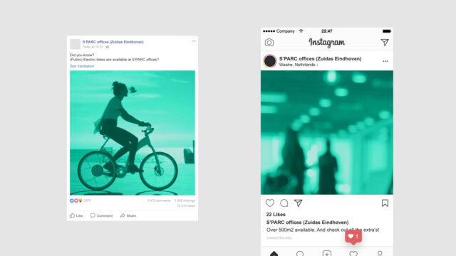
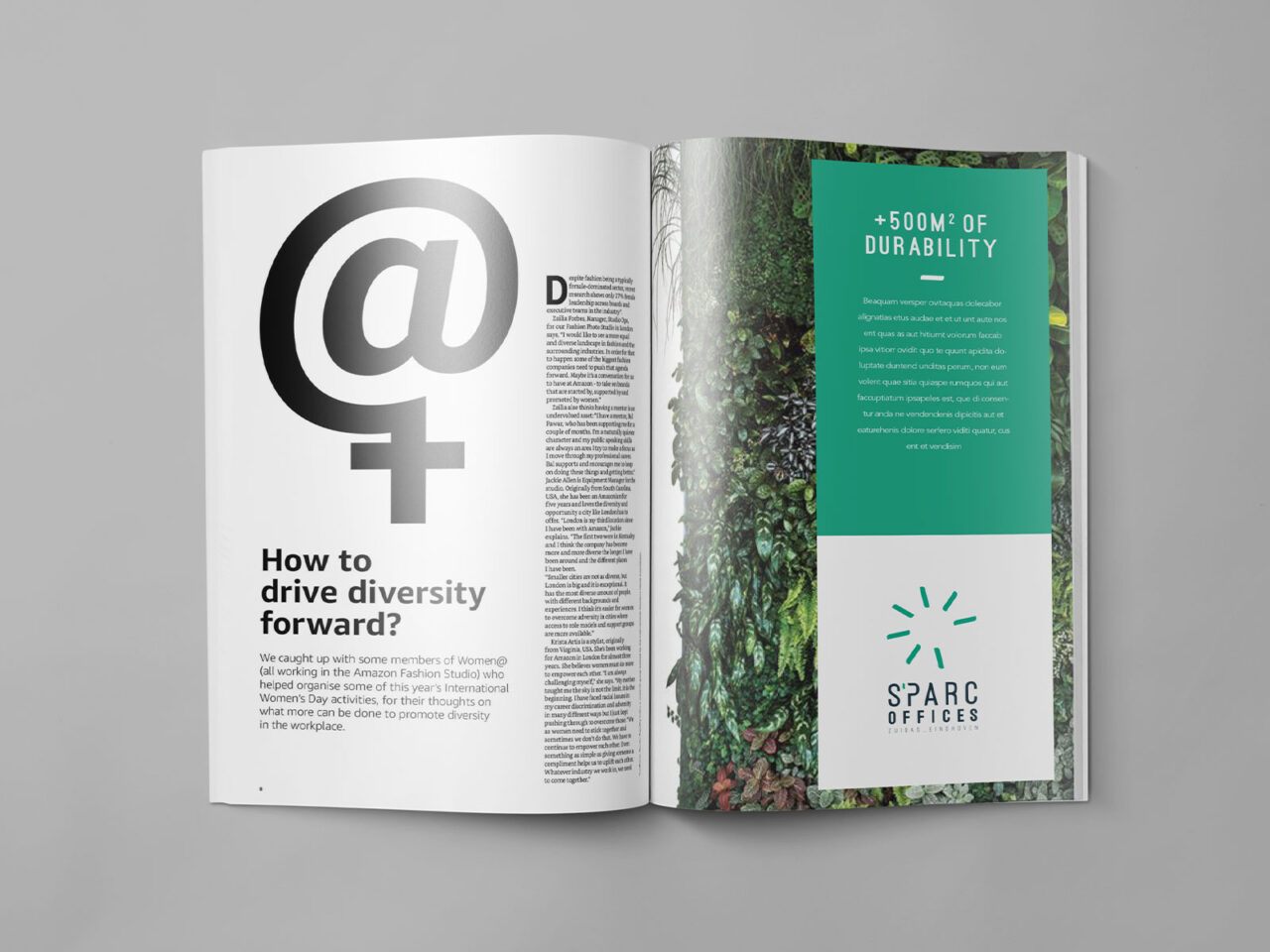
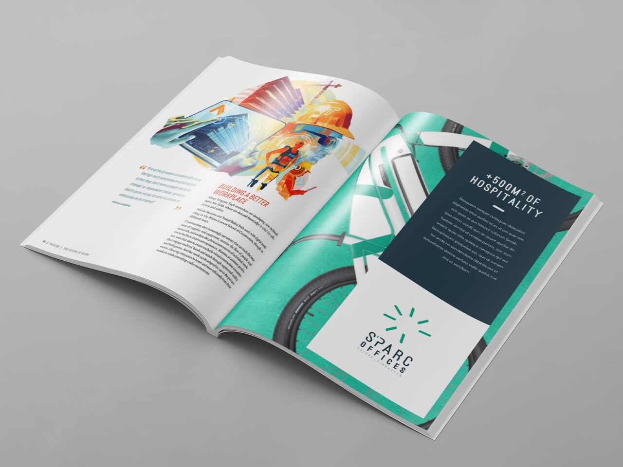
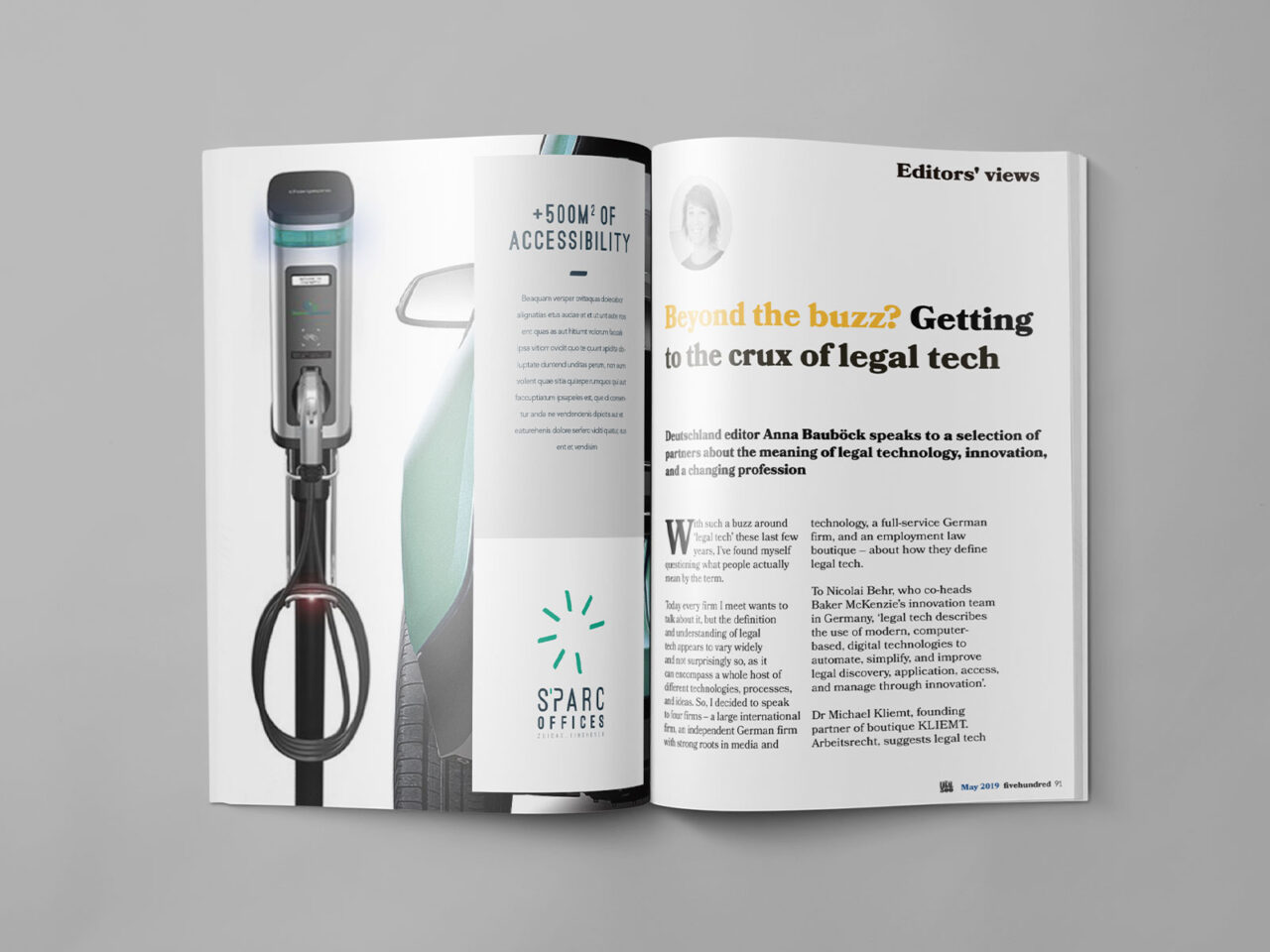
The brand combines the forward-thinking image of a cutting-edge rural tech ecosystem with the tranquil characteristics of its surroundings. These dual elements are woven into every aspect of the identity, from the name and logo to the visual language, creating a seamless representation of S’Parc’s dynamic yet grounded nature.
This rebranding highlights the balance between technological advancement and environmental harmony, positioning S’Parc as a distinctive destination for business innovation and sustainable growth.
The inspiration of technology and environment

Suggested color scheme


The idea behind the logo
The rebranding of Business Park Eindhoven into S’Parc draws inspiration from its name—a spark, symbolizing the genesis of great ideas and the driving force behind technological innovation. This concept is seamlessly blended with a natural element, the dandelion. Known for its delicate yet dynamic form, the dandelion visually mirrors a spark, embodying growth, connectivity, and potential.
The logo merges these two powerful symbols, representing S’Parc as a place where innovation flourishes in harmony with its serene, green surroundings. This thoughtful design reinforces the park’s identity as a hub for forward-thinking businesses that thrive in an environment where nature and technology intersect.


Digital presentation of the brand


Signage

Entrance


