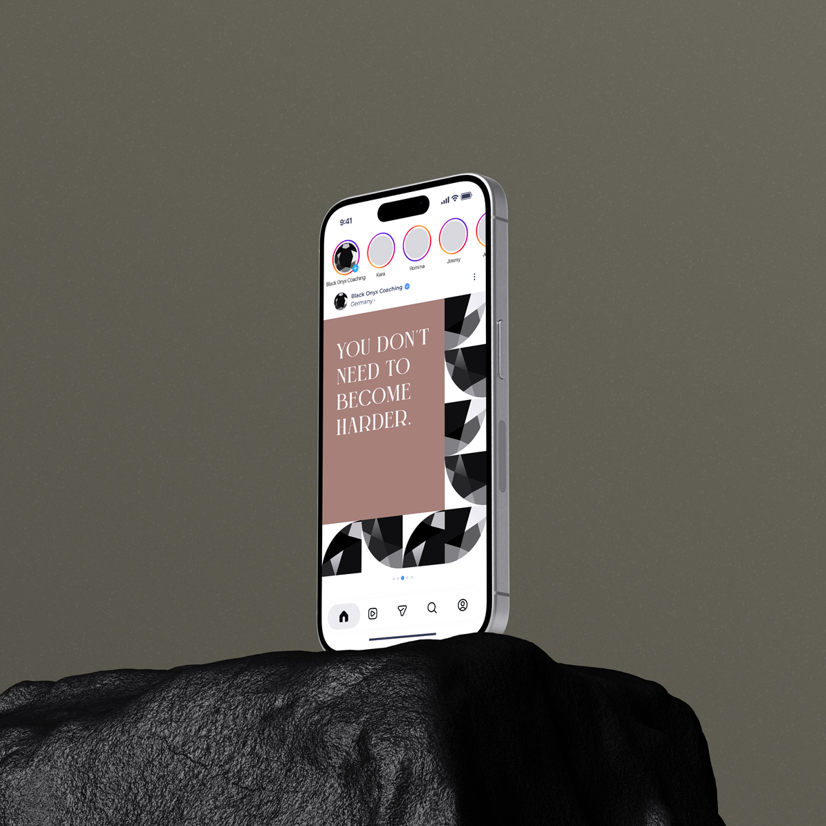
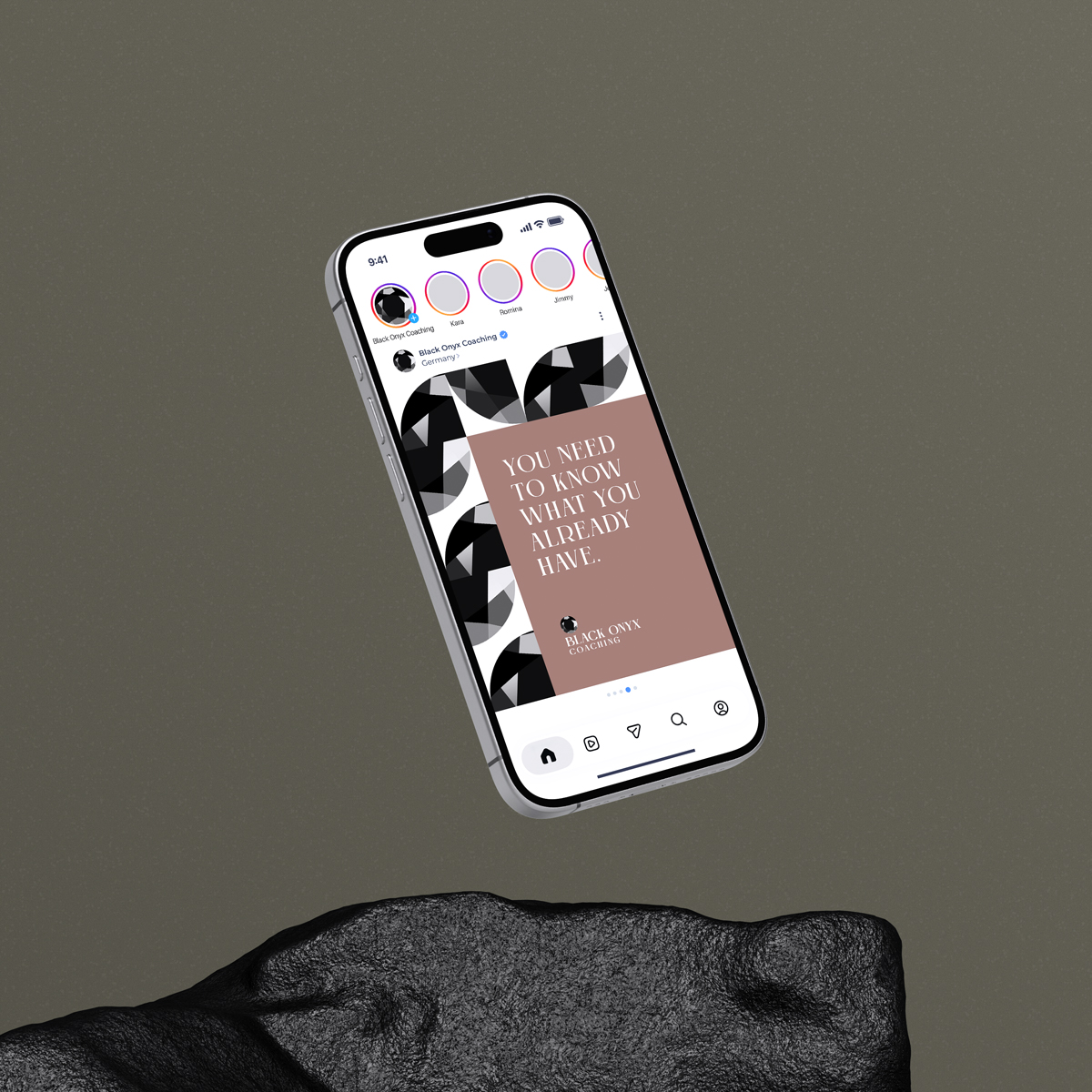
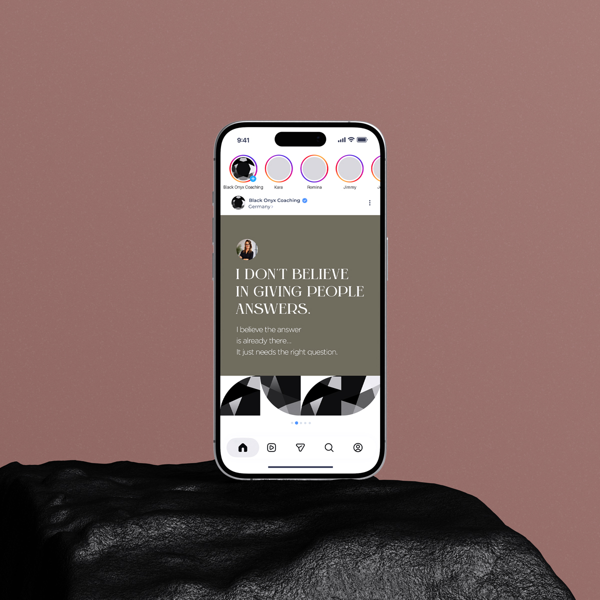
Logo & Brand Identity
Black Onyx Coaching
Role
Designer
Client
Black Onyx Coaching
The Story
This project started with a name and little else. A newly launched business coaching practice had chosen “Black Onyx” out of personal preference, with no defined meaning behind it, no visual identity, and no direction. My task was to build a brand from that starting point.
I began by researching the stone itself, and found something more interesting than expected: onyx doesn’t form under pressure, as the common narrative goes. It builds up layer by layer, over time, through mineral deposits. That felt like a far more honest metaphor for coaching, not a single breakthrough, but a gradual, layered process of insight.
The concept behind the logo
Onyx doesn’t form under pressure. It builds layer by layer, over time, wherever mineral-rich water flows along rock and slowly leaves its deposit behind. Every layer is a moment, every band a period. The result is a stone that carries its history within: visible, ordered, enduring.
A different story from diamonds under pressure. And a more honest metaphor for coaching.
Growth rarely happens in a single blow. It’s a layered process: insights accumulating, patterns gradually becoming visible, small shifts forming something lasting. Black Onyx guides people through that process, not with quick fixes, but with the space to discover what’s already within.
The faceted stone in this logo reflects exactly that. Each face is a different angle on the same core, just as coaching draws clarity from looking at yourself from multiple perspectives.

The mark
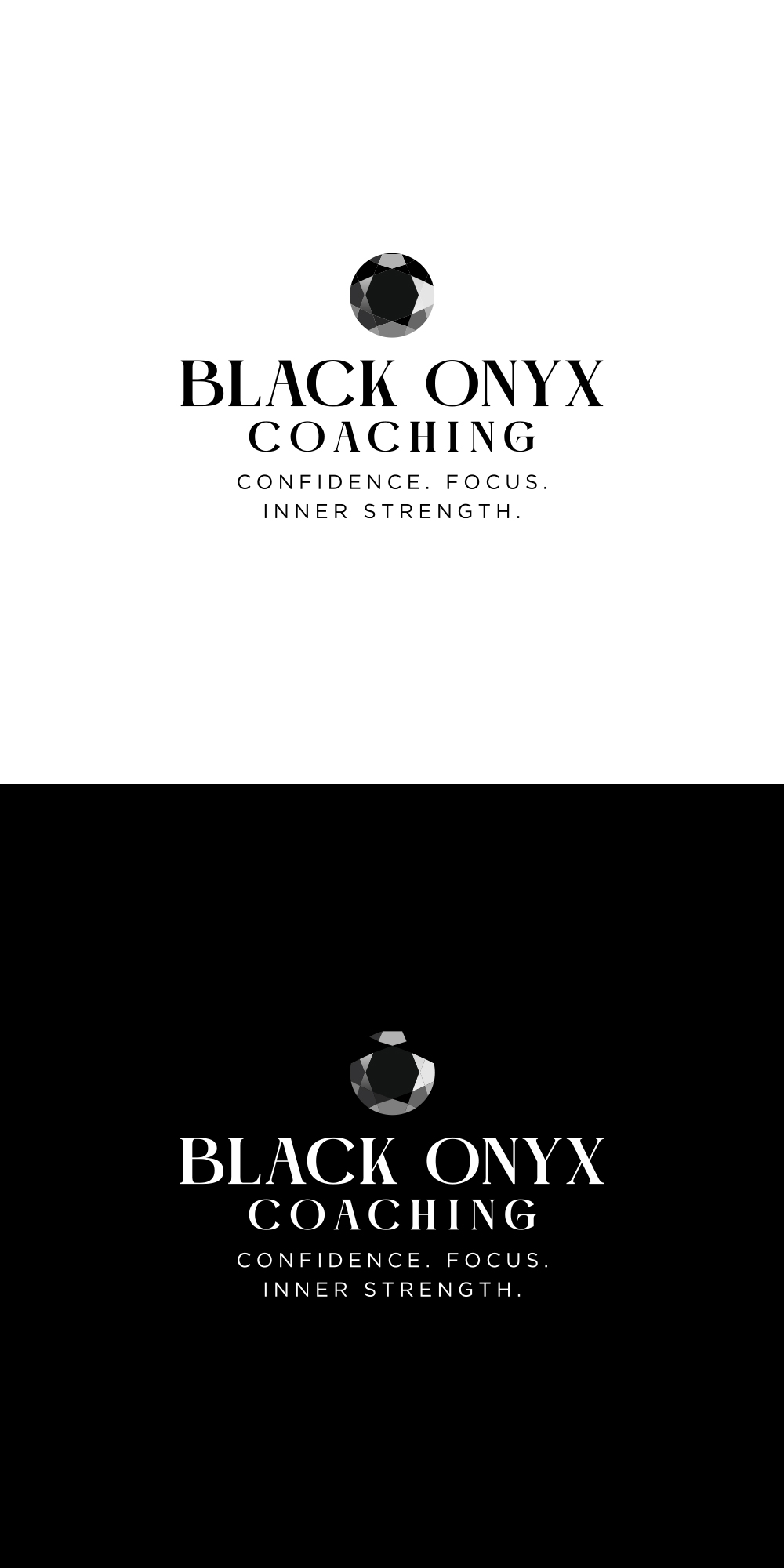
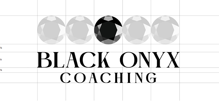
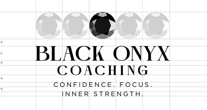
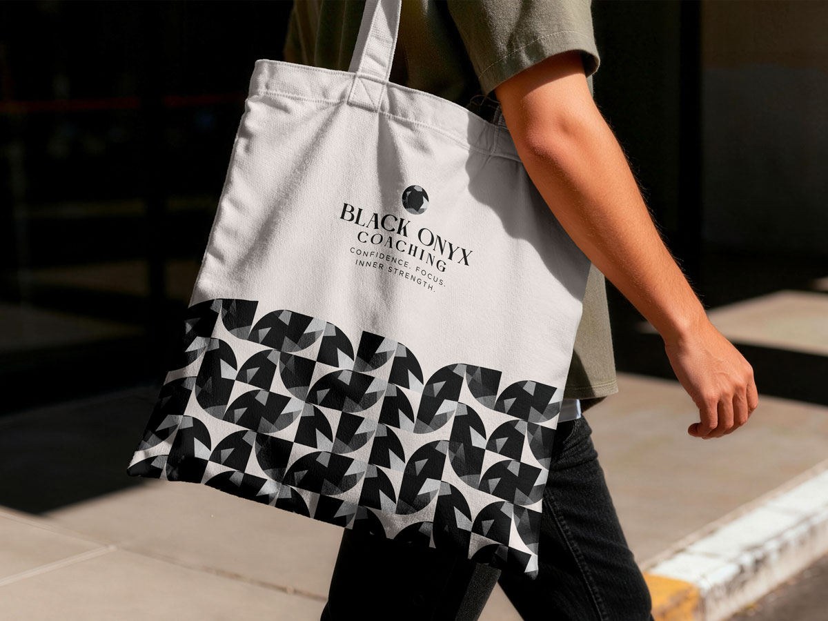
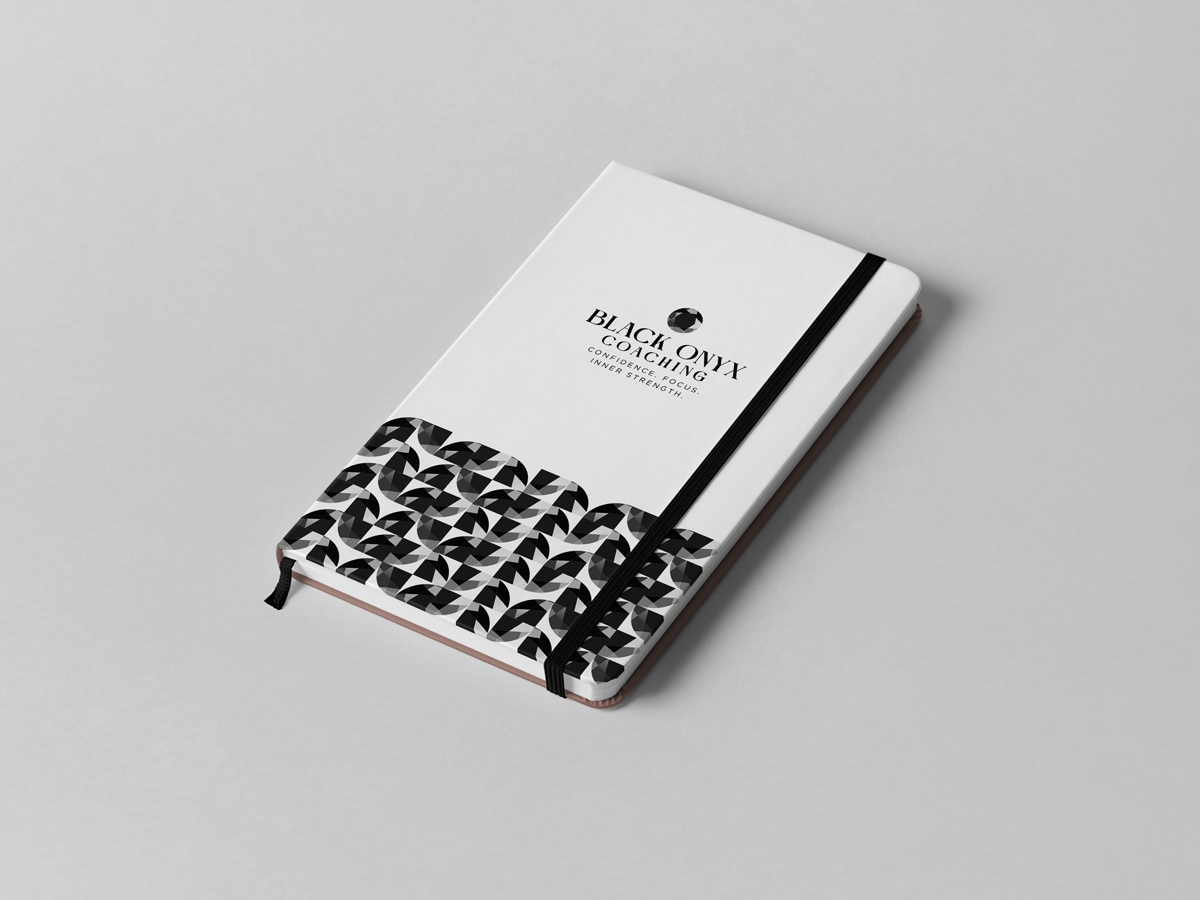
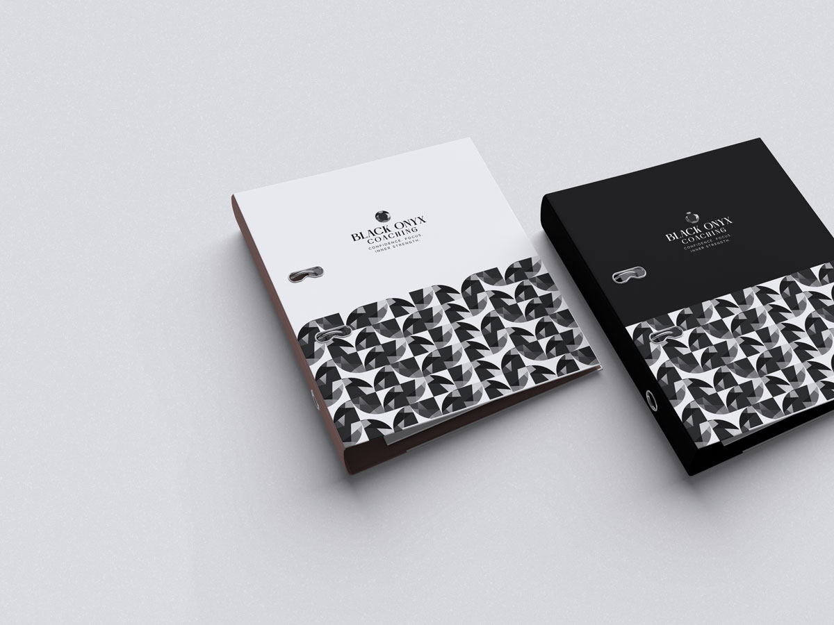
The mark is built on a vertical axis of symmetry. This is not a coincidence, it is a functional decision. A symmetrical form holds its integrity at any scale, in any orientation, against any background. It works as a favicon, as a watermark across a full-page spread, as an embossed detail on a business card. It doesn’t depend on colour to communicate. In black, in white, in grey. It remains itself.
This is precisely what the mark should communicate: a stable identity that doesn’t shift depending on context.
Form follows meaning
The faceted structure mirrors the core of the coaching work. No single face tells the whole story. Understanding comes from seeing multiple angles at once and recognising that they all belong to the same stone. The mark is not decorative. It is a diagram of the process.
Typography
The Castre font represents a distinct typographic direction for Black Onyx. One that shifts the aesthetic away from mechanical references and toward something more classical in origin, without sacrificing a contemporary sensibility.
Castre
The wordmark BLACK ONYX is set in Castre, a typeface rooted in classical typographic tradition but resolved with a modern eye. Where the other typographic variants draw from the mechanical and the industrial, Castre draws from a longer history. One of considered letterforms, balanced proportions, and quiet authority. It carries the kind of weight that doesn’t need to raise its voice. Set in capitals with open tracking, it gives the wordmark an elevated quality.
Gotham
The tagline “confidence. focus. inner strength.” is set in Gotham. Its geometric precision sits in productive contrast to Castre’s classical warmth. Where Castre looks back to move forward, Gotham is resolutely of the present. Together they create a pairing that feels both timeless and relevant.
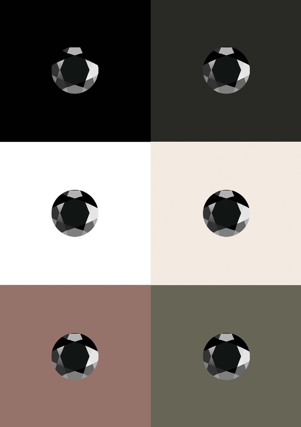
Additional color usage
Onyx Core
Sediment
Chalcedony
Banded Clay