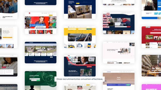
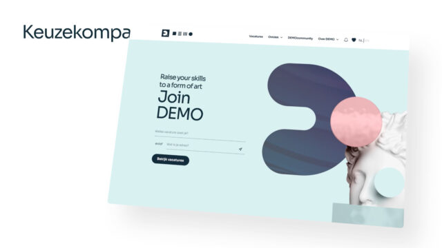
Identity
Floyd & Hamilton
Year
2020 – current
Role
Designer
Client
Floyd & Hamilton
The Story
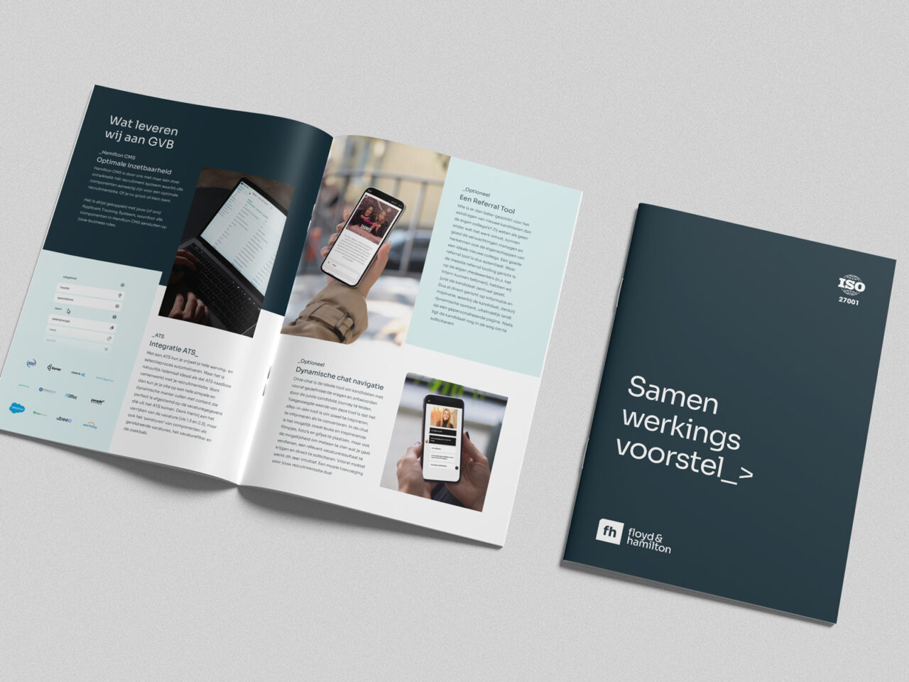
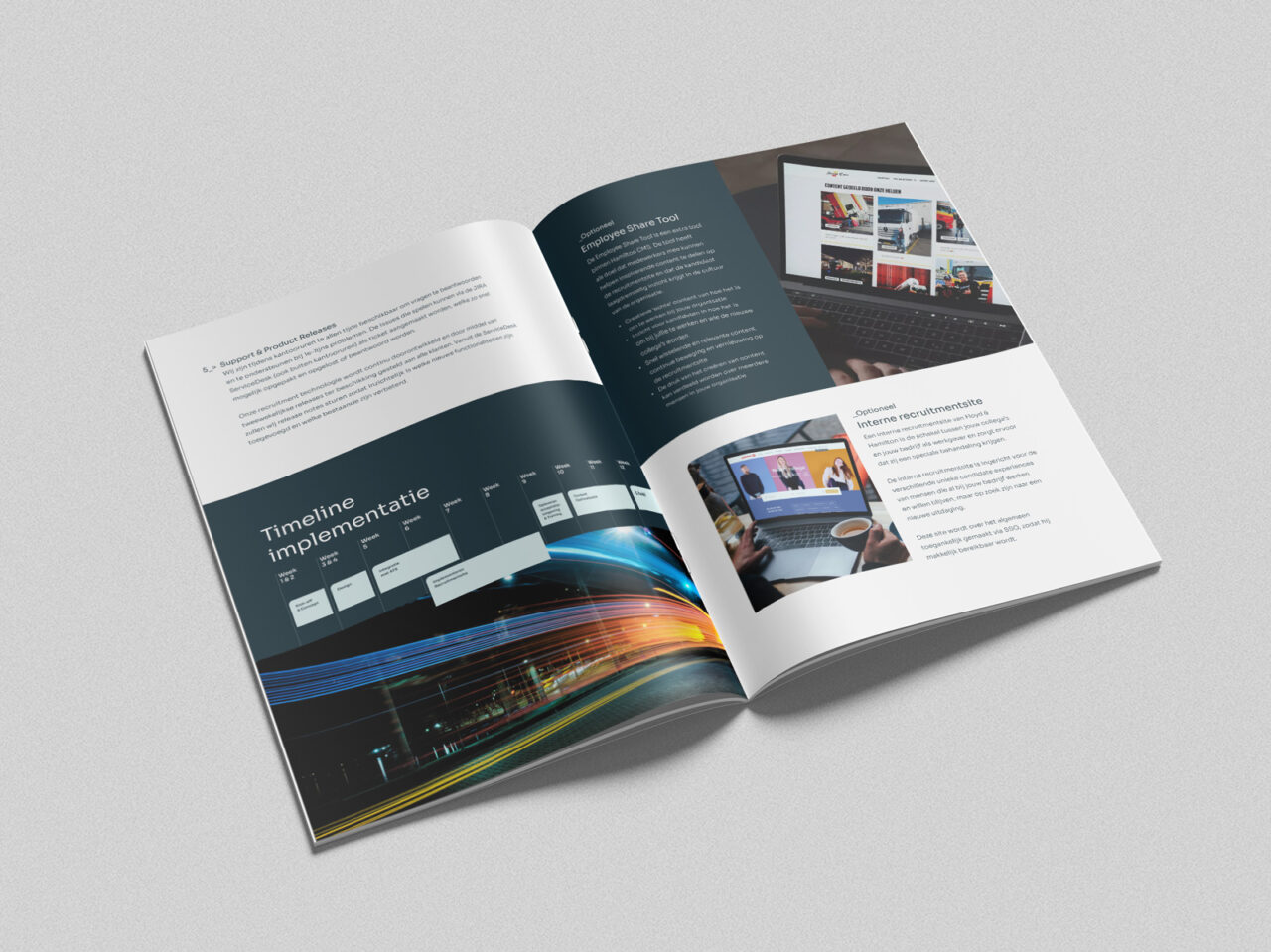
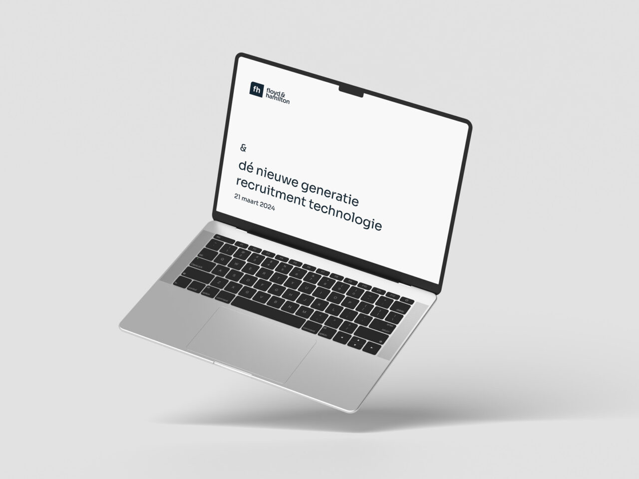
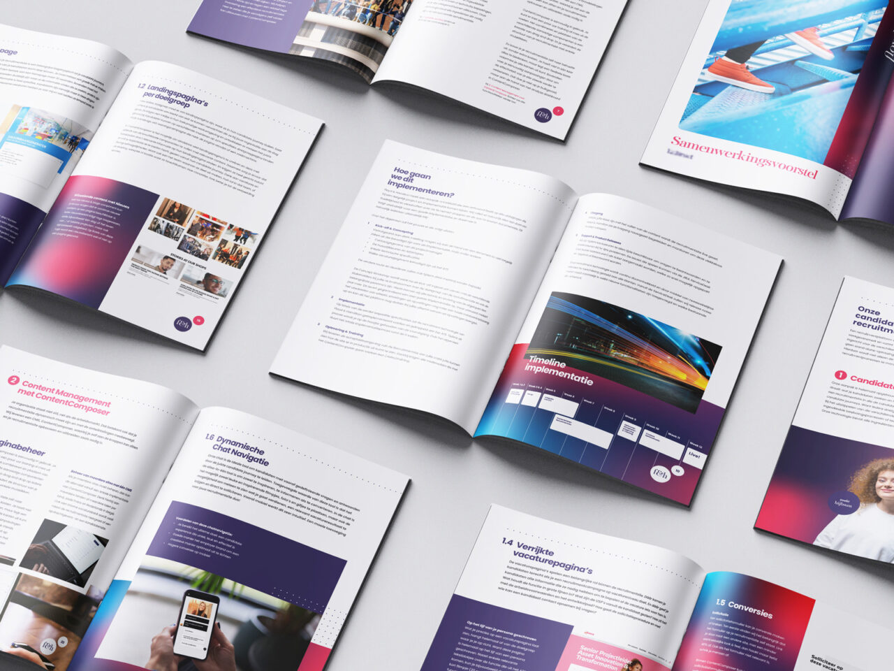
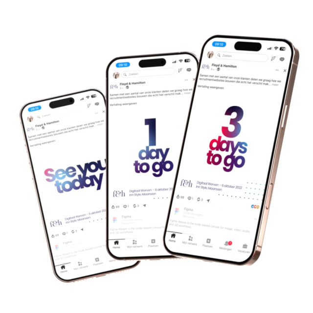
Floyd & Hamilton builds recruitment technology, including Hamilton CMS. I created and maintain the brand identity, from explanatory animations and branding elements to templates and publications, using young imagery and feminine colors to reflect the company’s open culture.
Phase 1
Original Identity
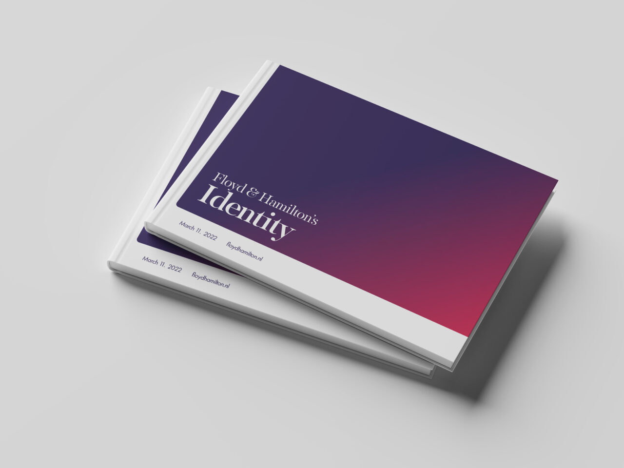
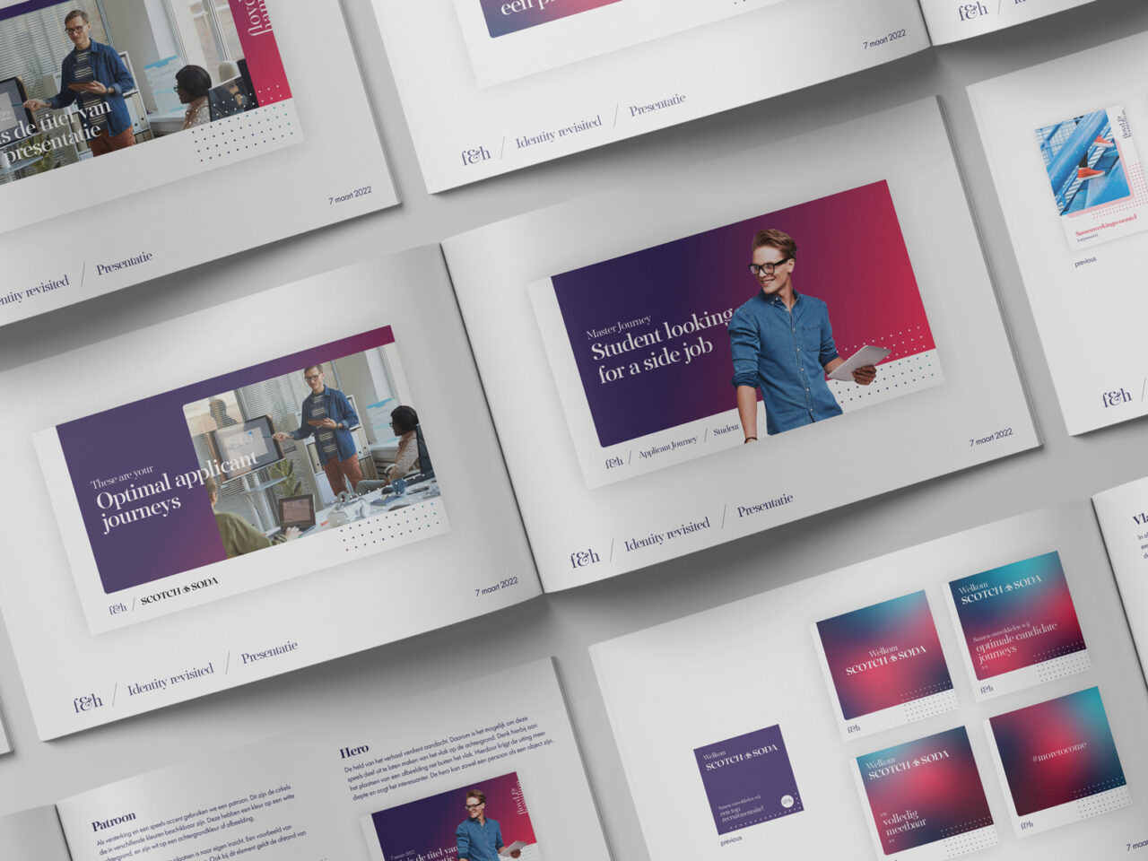
The first version of the Floyd & Hamilton identity was built from the ground up. I developed the visual language, including logo, color palette, typography, and the animated illustration style, that shaped how the brand presented itself across marketing and product.
Color Palette
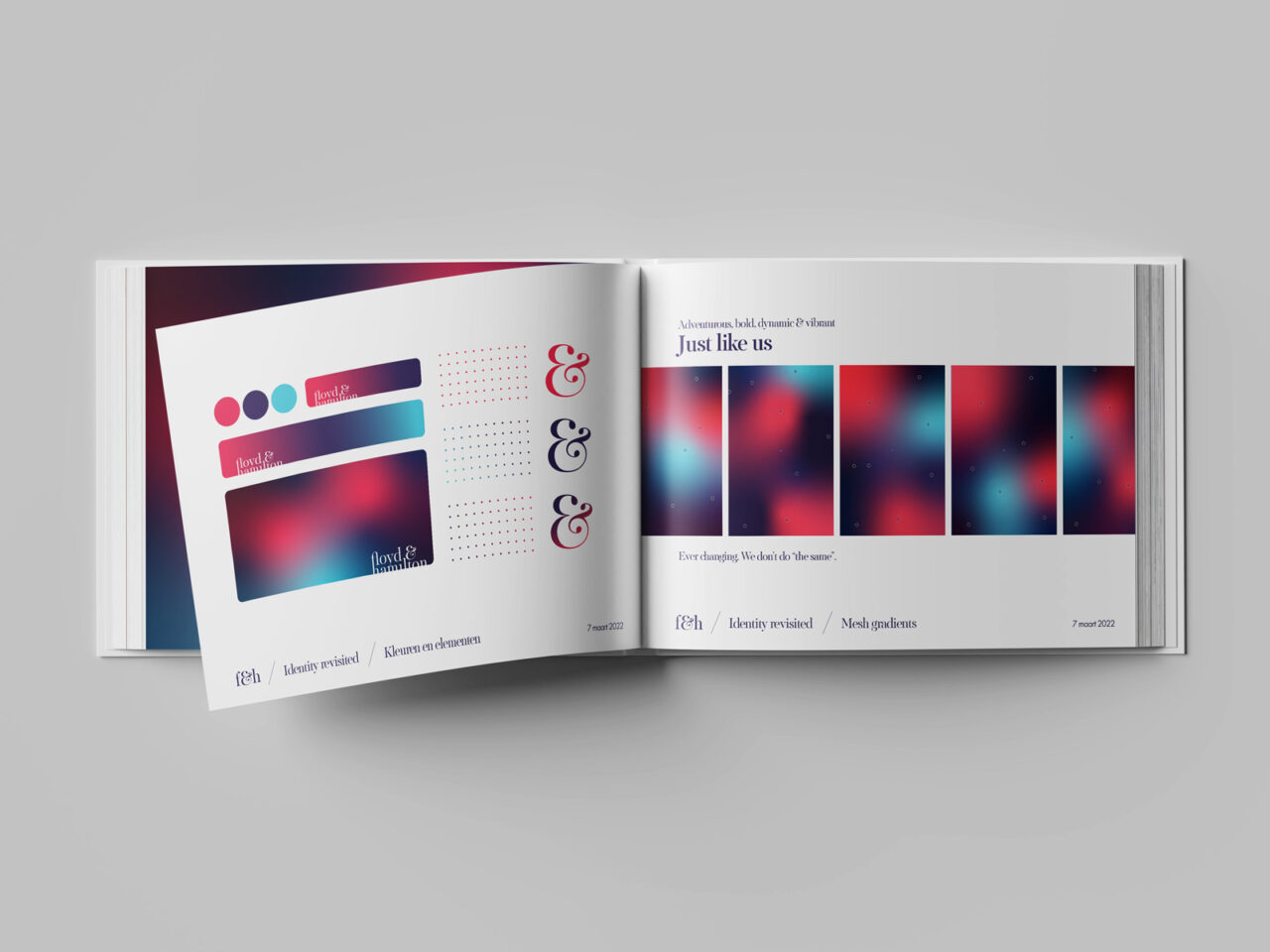
The Floyd & Hamilton palette is built around three bold, saturated tones: Crimson Pulse, Midnight Ink, and Electric Cyan. Rather than using flat blocks of color, the identity leans into rich gradients that blend these tones into one another, giving every application a sense of movement and energy. This reflects the brand’s adventurous, dynamic character in an industry that often plays it safe. Crimson Pulse brings warmth and boldness, Midnight Ink grounds the palette with depth and confidence, and Electric Cyan adds a vibrant, forward-looking edge. Together, they give Floyd & Hamilton a distinct, unmistakable presence across every touchpoint.
Identity in motion
The identity comes to life through a continuously shifting gradient animation, where Crimson Pulse, Midnight Ink, and Electric Cyan flow into one another without ever settling into a fixed state. This everchanging movement is a deliberate reflection of who Floyd & Hamilton is: adventurous, bold, dynamic, and vibrant. Nothing about the brand stands still, because Floyd & Hamilton doesn’t do “the same.” The gradient becomes a visual signature of that mindset: always in motion, always evolving, never repeating itself in exactly the same way twice.
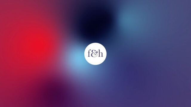
Crimson Pulse
Midnight Ink
Electric Cyan
Shapes & Corners
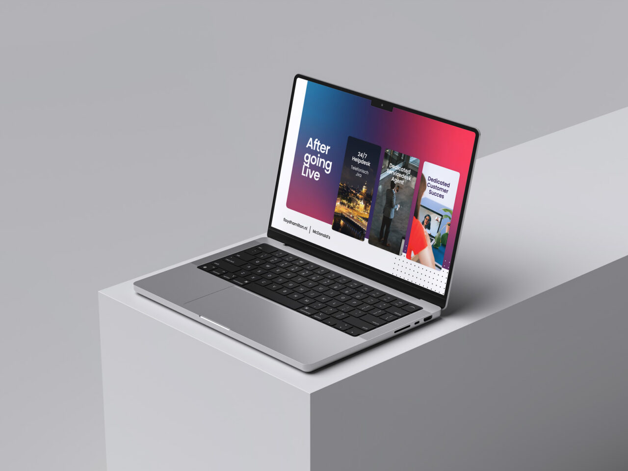
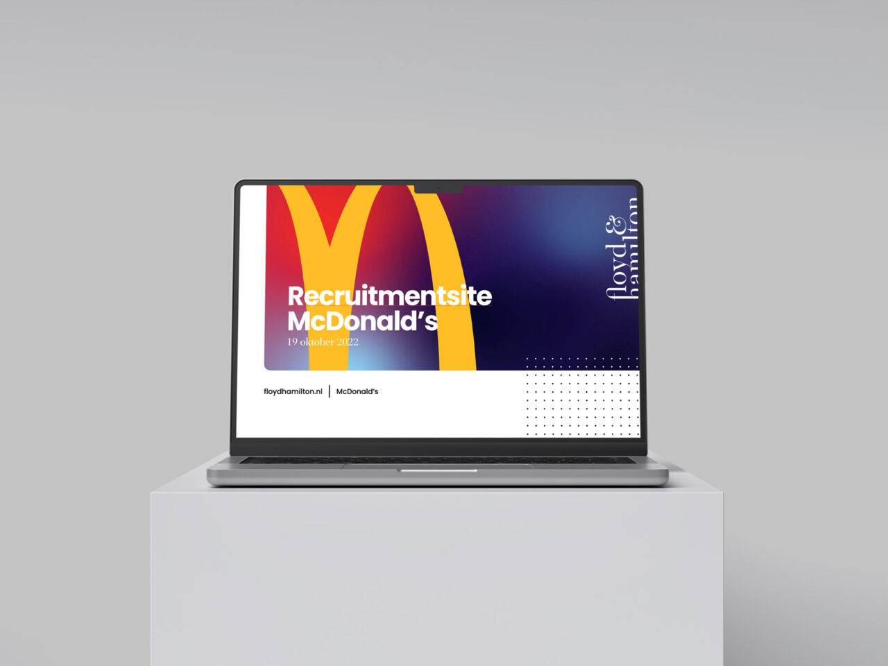
Every surface, from cards to image blocks to presentation slides, uses soft rounded corners. This keeps the bold gradients and colors feeling approachable rather than sharp or corporate. Straight edges are avoided in favor of this consistent, rounded language across all formats.
Dot Pattern
A grid of small dots, colored in the brand palette, appears as a recurring detail in the corner of layouts. It’s a quiet signature element, small enough to stay in the background but present enough to reinforce the identity even on the simplest slide or template.
Typography
Headlines use a classic serif typeface, giving the identity a sense of confidence and craft that balances out the vibrant colors and gradients. Supporting text stays clean and simple, so the serif headline remains the clear focal point in every layout.
The Ampersand Mark
The ampersand from “Floyd & Hamilton” doubles as a standalone brand mark. Rendered in the gradient palette, it can be used on its own, on merchandise, loading screens, or as a subtle brand moment, without needing the full logotype next to it.
Phase 2
Evolving the brand
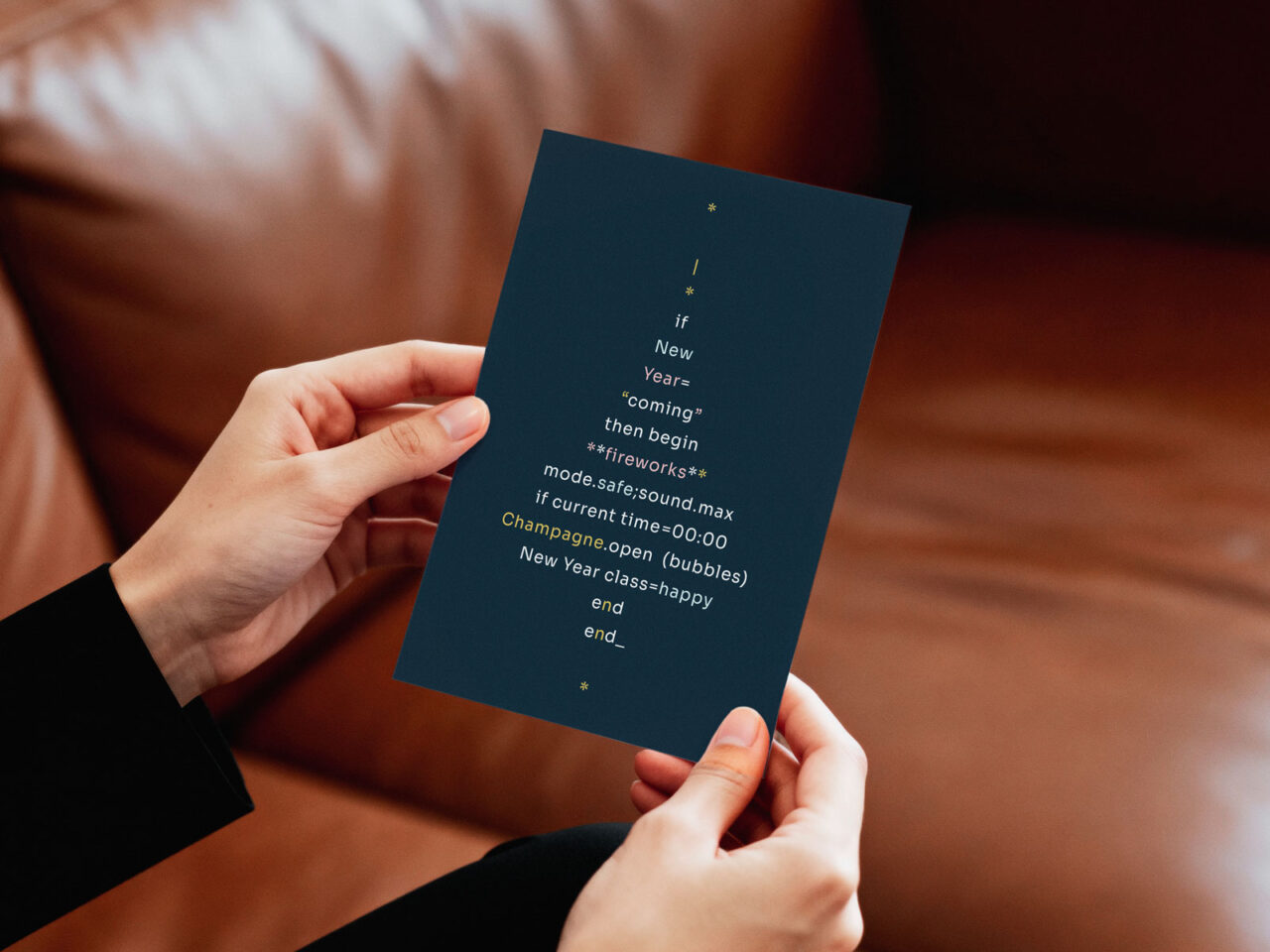
A darker, more technical direction was chosen for this stage, drawing on the visual language of a developer’s terminal: deep, near-black backgrounds, monospaced typography, and sharp accent colors echoing syntax highlighting. This direction was set externally, and I joined to help develop it further, extending it into practical brand applications and additional touchpoints as the identity matured. It grounds the brand in the technical nature of the product itself, adding a more engineered feel alongside its original vibrant character.